Logo Color Schemes
Analogous

McDonalds uses the analogous colors of red and orange.The company probably chose these colors because they are warm, like their hot food, along with the color red makes people hungry.
Complementary

Krispy Kreme uses the complementary colors of red and green. They choose these so possibly the words on the top would stand out behind the background.

Fire fox uses the complementary colors blue and orange to make the fox stand out, and like the name implies, the bright orange color of the fox resembles fire.


 This baseball team uses the cool colors green and blue, because their mascot seems to be a kind of ocean creature pushing water while hitting the ball.
 YMCA uses the cool colors of purple and blue to give off a cool and relaxing feeling of going there.
 Netflix uses the monochromatic color red because it gives the warm feeling you want while watching a movie or TV show.
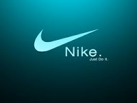
Nike used the monochromatic color of blue to create a refreshing calm feeling, and the contrast brings attention to the logo.
 The superman logo uses the triad colors red, yellow and blue to make a full contrast, bringing attention to every part of the design.
 Burger King uses the triad colors of red, yellow, and blue. Red is the most noticeable as it makes up most of the logo, bringing the most attention to the name.

Fire fox uses the complementary colors blue and orange to make the fox stand out, and like the name implies, the bright orange color of the fox resembles fire.
Warm
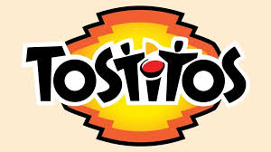
Tostitos uses the warm colors of yellow, red, and orange in there logo because it may give off the feeling of a warm and happy party environment.

Pringles uses the warm colors of red and yellow to also give out the party environment, so people will be more likely.
Cool

 YMCA uses the cool colors of purple and blue to give off a cool and relaxing feeling of going there.
Monochromatic
 Netflix uses the monochromatic color red because it gives the warm feeling you want while watching a movie or TV show.
Triad colors

 Burger King uses the triad colors of red, yellow, and blue. Red is the most noticeable as it makes up most of the logo, bringing the most attention to the name.
Comments
Post a Comment